PLBRASIL :: A CHANGE OF BRAND TO THE HEIGHT OF THE CLIENT
PLBrasil was created over 10 years ago, with the challenge of reducing bureaucracy and streamlining processes with paralegals and legal representation solutions of excellence.
Supported by quality, PLBrasil has gained a fast market share and has been in the ranking of the fastest growing SMEs in Brazil, promoted by Exame magazine.
A growth that generated many opportunities and gave rise to the need for a corporate identity that would rescue the history and mean the company’s new performance.
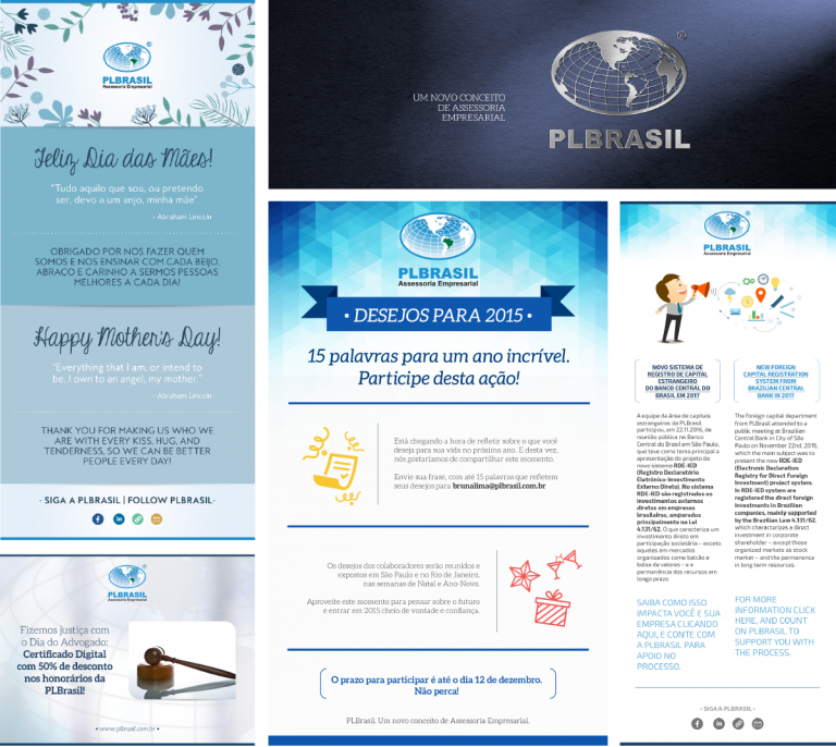
Before the work, there was a lack of unity in the various materials of the brand
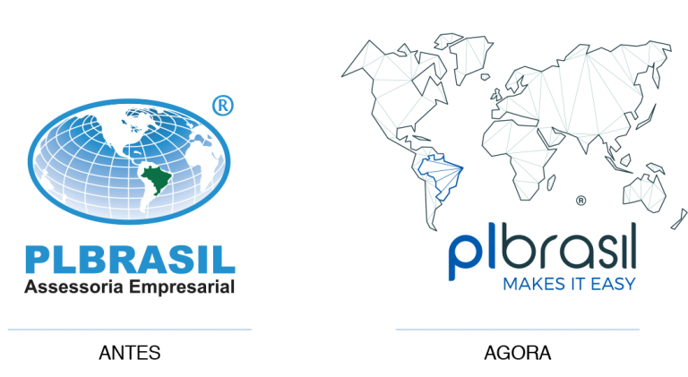
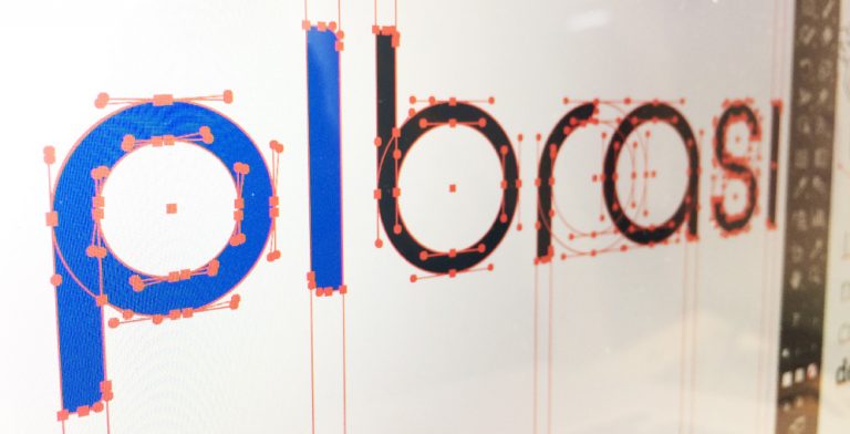
The need to synthesize the forms was based on the concept that PLBrasil needed to convey: to simplify the bureaucratic processes of paralegal services.
PLBRASIL + SABIÁ
A brand change suitable to the customer
The first step was to raise the meaning of the old brand with employees and directors.
The research made clear the need to keep the color blue and the globe as icons of history.
The globe was incorporated as inspiration of the font, designed exclusively for the brand.
The map design has been modernized and gained lines that refer to the global connections of the brand.
The slogan, Makes it Easy, reinforces the worldwide positioning and explains, in a direct way, the purpose of the company.

The challenge: to renew the identity without losing the connection with the old one.
The map is still present and the colors still keep the previous pattern.
EVOLVE AND MULTIPLY
The family has expanded
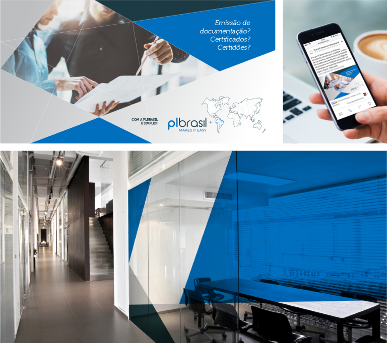
The brand was born prepared to embrace the PLBrasil Group’s new business areas, such as: translation, coworking and insurance.
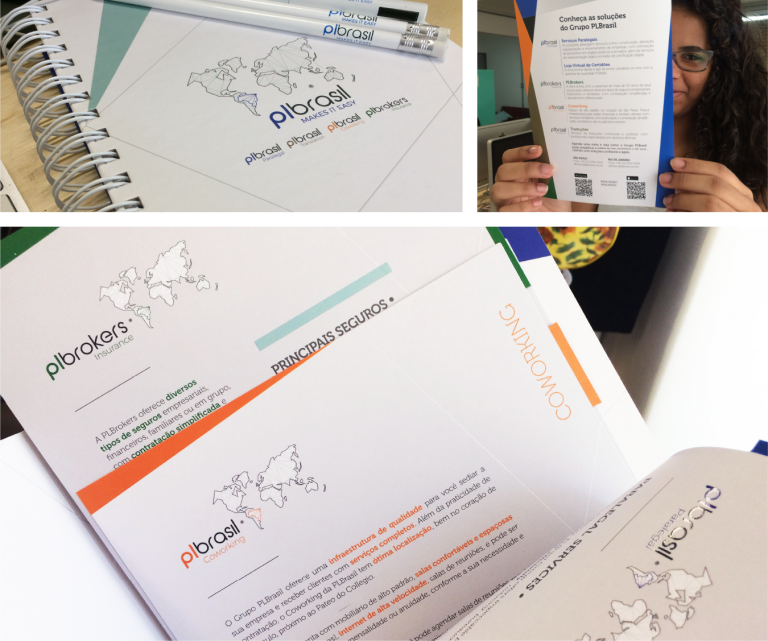


The new coworking area has gained an inspiring air, with colorful and well-lit environments.
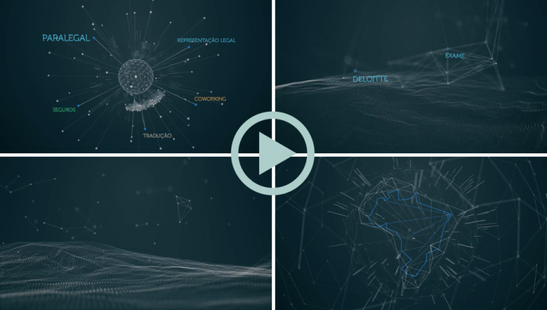
Video produced to divulge the new identity and new segments.
Results
Sabiá sought a representation that would translate the PLBrasil Group’s value proposition, presenting a reliable business partner:
• History respected, identity renewed.
• Team, partners and suppliers more engaged and involved with the business.
• Identity capable of incorporating new business units.
• Brand prepared for the international market.
Segmento: Consultorias