
Sabiá developed the brand rebranding while preserving its essence to create an integrated visual system for Obuc, Obuc Tech, and Obuc Engenharia
Context
A group with two fronts of activity and an identity built upon the “cube”
Obuc is a business group that operates in two areas: Technology and Civil Engineering. The group stands out for its technical excellence and its ability to deliver innovative services and solutions.
An interesting fact is that its name carries a unique concept, an anagram of “cube” in reverse. More than a word game, this concept remains present in communications and guides the brand's identity.
Challenge
Update a brand created in 2013 without losing its original essence
Obuc sought out Sabiá to solve the rebranding challenge and revitalize its visual identity, without losing its essence. It was necessary to ensure that the new brand accurately represented and strengthened its market positioning.
The solution
An integrated visual system for Obuc and its two business verticals
A Sabiá developed the new brand from the concept that gives rise to the name Obuc – the cube. This inspiration guided the creation of a solid, modern, and versatile visual identity.
With synthetic drawing, the Obuc cube gained prominence:
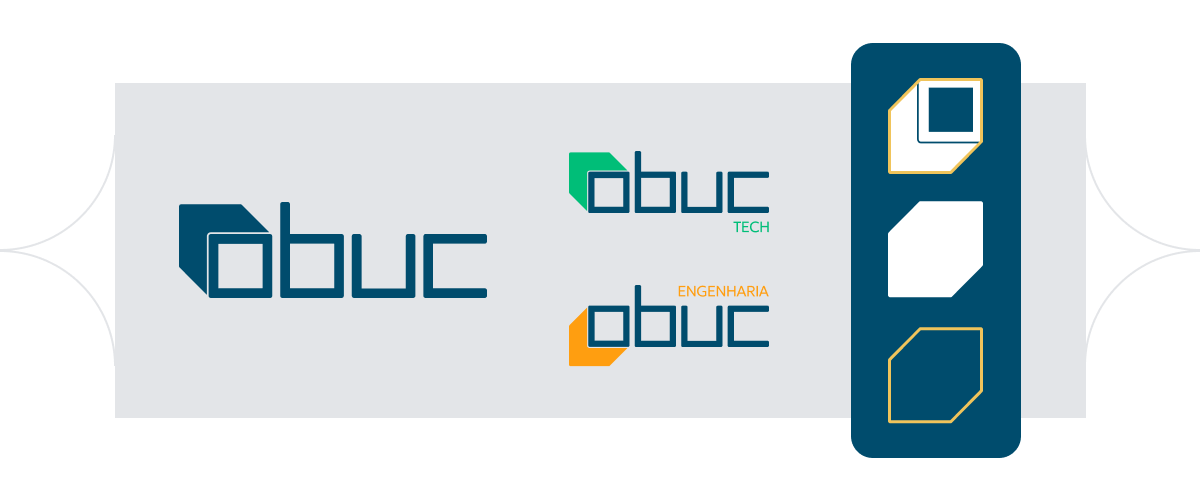
In addition to the main brand, we developed sub-brands for each business vertical: Obuc Tech and Obuc Engineering, connected within the same visual system, ensuring unity and recognition.
The new visual identity features a wealth of graphic elements, all inspired by geometric shapes derived from the cube, and allows for different applications and compositions, always maintaining brand coherence and reinforcing its presence in any context.

Results
More modernity, consistency, and recognition for the Obuc brand
- Main brand of the group renewed, conveying modernity and solidity.
- Well-defined sub-brands, ensuring clarity for business verticals.
- Versatile and applicable identity, with graphic elements that strengthen the brand's presence across different channels.
- Greater recognition and consistency in communications, reinforcing Obuc's connection with its market and strategic audiences.
“In our first project with Sabiá, we worked on rebranding Obuc, which already had an outdated visual identity developed in 2013 when the company opened. Throughout the entire process, Sabiá did an excellent job, both from a creative standpoint and in terms of the quality of the deliverables. We were able to join forces with Obuc's creative team to consider the essence of this new identity, and looking at the final result, we are certainly extremely satisfied.
Obuc has a new look that, certainly within weeks of its launch, has generated positive impacts for both our clients and internally, aiding in the identity process of the group and each company.” Diego Beires Project Director at Obuc